A Strategy for the Analysis of Dissolution Profiles
In this article, a new method for the analysis and comparison of dissolution profiles is proposed and illustrated with case studies. This useful strategy makes effective use of dissolution profile data by using all data in each profile to create two statistics: profile level and profile shape. The profile level relates to the area under the profile and reflects the “exposure” of the patient to the drug. The shape statistic is related to the rate of increase of the drug dissolution over time. These characteristics enable practical interpretations regarding the factors studied in the experiment. The method is easy to use, requiring only straight-line regression and design of experiments analysis procedures. A modified principal component analysis (MPCA) is recommended as an alternative approach when the proposed model does not give an adequate description of the data.
Dissolution Profile Behavior
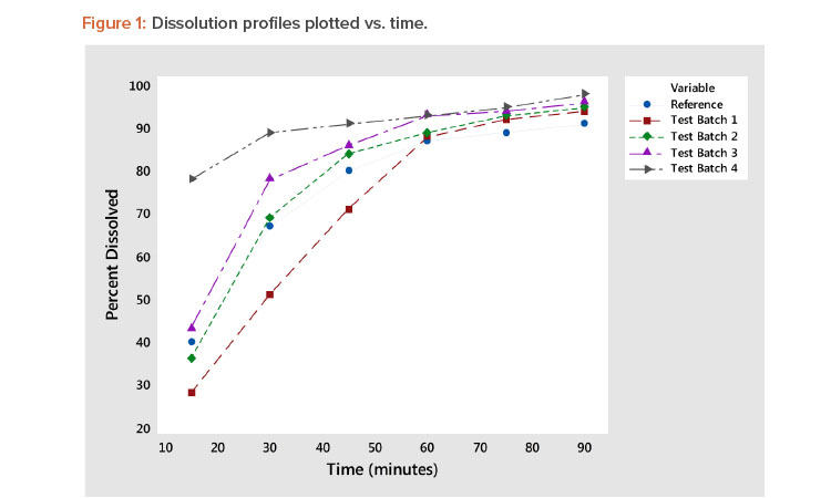
Rate of dissolution is a critical quality attribute of a pharmaceutical tablet. Tablet dissolution is typically studied by examining the form of the dissolution profile, which is the percentage of the tablet dissolved at various points in time. Figure 1 shows five such dissolution profiles—the reference plus four test batches—generated in a study reported by Shah et al1 . Figure 1 shows a typical variety of a dissolution profile. Some start at low dissolution levels (e.g., 25%–40% at 15 minutes), whereas others start at approximately 75% at 15 minutes. The result is a collection of dissolution profiles with a variety of response patterns.
Experiments are commonly conducted to study the effects of various factors on the dissolution profile. The complicating issue in the analysis of dissolution is that the response is a “profile” involving several data points rather than a single response metric. This article describes a new approach that reduces the profile to two statistics: one measuring the profile level and the other measuring the profile shape. Note in Figure 1 that the batch 4 profile has a high average value (level) and a low slope (shape). Batch 1 has a low average value (level) and a high slope (shape). The other dissolution profiles (reference, batch 2, and batch 3) are in between the dissolution profiles of test batches 1 and 4 and are very similar. These observations are supported by the profile average and slope statistics shown in Table 3, presented later in this article.
Several methods have been proposed to analyze dissolution profiles (see Table 1). After reviewing the available methods, the proposed approach is described and it is shown how the new approach overcomes the limitations of the existing procedures.
- 1Shah, V. P., Y. Tsong, P. Sathe, and J. P. Liu. “In Vitro Dissolution Profile Comparison—Statistics and Analysis of the Similarity Factor, F2.” Pharmaceutical Research 15, no. 6 (June 1998): 889–96.
| Method | Description | Comment |
|---|---|---|
| 1 | Pick a particular point in time and base results and conclusions on this data | Ignores results at other time points |
| 2 | Analyze results at each point in time separately—if the profile consists of p time points, then p analyses are performed | Interpretation may be complicated as the results of the p analyses have to be integrated to arrive at a conclusion |
| 3 | Similarity factor analysis1 | Useful for comparing only two profiles |
| 4 | Fit a model to each profile separately and analyze the calculated model coefficients as the responses; for example, a three-coefficient model results in three analyses 2 | Number of analyses is reduced; a single model needs to be found that will describe all the curves |
| 5 | Repeated measures ANOVA3 | Provides a single model for the analysis of the profiles; provides tests of significance for profile level and shape; does not provide a statistic to measure profile shape |
| 6 | Multivariate ANOVA4 | Can require a large number or repeated dissolution profile experiments; does not provide a statistic to measure profile shape |
| 7 | MPCA3 | Provides tests of significance for profile level and shape; level and shape statistics are analyzed to study effects of experimental factors |
| Time (minutes) | Reference Drug | Test Batch 1 | Test Batch 2 | Test Batch 3 | Test Batch 4 | Average Profile |
|---|---|---|---|---|---|---|
| 15 | 40 | 28 | 36 | 43 | 78 | 45.0 |
| 30 | 67 | 51 | 69 | 78 | 89 | 70.8 |
| 45 | 80 | 71 | 84 | 86 | 91 | 82.4 |
| 60 | 87 | 88 | 89 | 93 | 93 | 90.0 |
| 75 | 89 | 92 | 93 | 94 | 95 | 92.6 |
| 90 | 91 | 94 | 95 | 96 | 98 | 94.8 |
| Average | 75.7 | 70.7 | 77.7 | 81.7 | 90.7 | 79.3 |
Available Methods for Analyzing Dissolution Experiments
Several univariate and multivariate methods have been proposed to study the effects of experimental factors on the dissolution profile. Seven such methods are summarized in Table 1. Each method can be useful given a particular set of circumstances.
These methods have the following general limitations:
- Methods 1 and 2 don’t take advantage of all information in the dissolution profile.
- Method 4 requires a model to be fit to each dissolution profile. A single model that will be descriptive of all the dissolution profiles is often hard to find.
- Methods 5, 6, and 7 require the use of sophisticated statistical procedures such as repeated measures analysis of variance (ANOVA), principal component analysis, and multivariate ANOVA methods.
- With the exception of method 7 (MPCA), these methods do not directly address dissolution profile level and shape.
A method is needed that provides statistics that relate to dissolution profile level and shape. In the process, the number of points on the dissolution profile is reduced to these two statistics. For the associated analysis, it should be easy to understand, to interpret the results, and to perform the needed calculations. The goal is to find a strategy that works in a variety of situations.
Example 1: Linearizing Dissolution Profiles
As noted previously, the complicating issue in the analysis of dissolution experiments is that the response is a profile involving several data points rather than a single response metric. The methods proposed in the literature work to reduce this complexity by performing various types of univariate or multivariate statistical analyses. The univariate methods often ignore important information, whereas the multivariate methods can be complicated to perform and interpret.
The goal proposed here is to find a time-based metameter that will result in a straight line when the dissolution profile is plotted vs. the time metameter. The time metameter is a time-based quantity that conveys the magnitude and nature of the time effect. The result is the profile being reduced to two parameters: the slope and intercept of the linearized profile. The work of Rao5 and Mandel6 show that the overall average profile provides such a metameter in many cases.
Rao5 comments: “The success then exists in replacing the various observations on growth (dissolution) by a few summary figures which lead to most efficient comparison between groups. … If, however, time can be transformed by a function r = G(t) in such a way that the growth rate is uniform with respect to chosen time metameter, then an adequate representation is available in terms of the initial value and the redefined uniform rate.” In other words, a plot of dissolution profile vs. the time metameter is a straight line.
Mandel6 shows for two-way tables of data that “we have already seen how the row-linear model can be understood as consisting of a bundle of straight lines, one for each row, when the rows are plotted against their common column averages.” In Mandel’s model, each “row” of the data table is adissolution profile resulting from a set of experimental conditions.
dissolution profiles have two general properties: level and shape. The ideal approach would be to have a single statistic to measure level and a second statistic to quantify shape. If each dissolution profile can be described by a straight-line model of the form:
| Batch | Average (A) |
Slope (B) | Correlation with Average Profile |
|---|---|---|---|
| Reference | 75.7 | 1.032 | 0.999 |
| Test Batch 1 | 70.7 | 1.376 | 0.983 |
| Test Batch 2 | 77.7 | 1.182 | 0.997 |
| Test Batch 3 | 81.7 | 1.049 | 0.989 |
| Test Batch 4 | 90.7 | 0.361 | 0.983 |
- 1 a b
- 2Yuksel, N., A. E. Kanik, and T. Baykara. “Comparison of In Vitro Dissolution Profiles by ANOVA-Based, Model-Dependent and -Independent Methods.” International Journal of Pharmaceutics 209, no. 1–2 (November 2000): 57–67.
- 3 a b Wang, Y., R. D. Snee, G. Keyvan, and F. J. Muzzio. “Statistical Comparison of Dissolution Profiles,” Drug Development and Industrial Pharmacy 42, no. 5 (2016): 796–807.
- 4Cole, J. W., and J. E. Grizzle. “Application of Multivariate Analysis of Variance to Repeated-Measurements Experiments.” Biometrics 22, no. 4 (1966): 810–28.
- 5 a b Rao, C. R. “Some Statistical Methods for Comparison of Growth Curves.” Biometrics 14, no. 1 (1958): 1–17.
- 6 a b Mandel, J. Analysis of Two-Way Layouts. New York: Chapman and Hall, 1995.
Yt = A + B*(APt – APavg)
where:
Yt = Dissolution of the tablet at time t
A = Average of the profile (profile level)
B = Slope of the linear relationship (profile shape)
APt = Average profile value at time t
APavg = Average value of the average profile
In this model, the slope (B) and intercept (A) of the straight line summarize all the information in the profile. Without loss of generality, this straight-line model is constructed so that the intercept (A) is the average of the profile.
The intercept (A) and slope (B) have an important practical interpretation. The profile average (A) is the profile level statistic; it measures the area under the profile and reflects the patient exposure to the drug after dissolution begins. The slope statistic (B) reflects the profile shape and measures the rate of dissolution vs. the rate of the average profile. For example, a dissolution profile slope of B = 1.20 implies the associated profile has a dissolution rate that is 20% higher than that of the average profile.
Proposed Method for Dissolution Profile Linearization
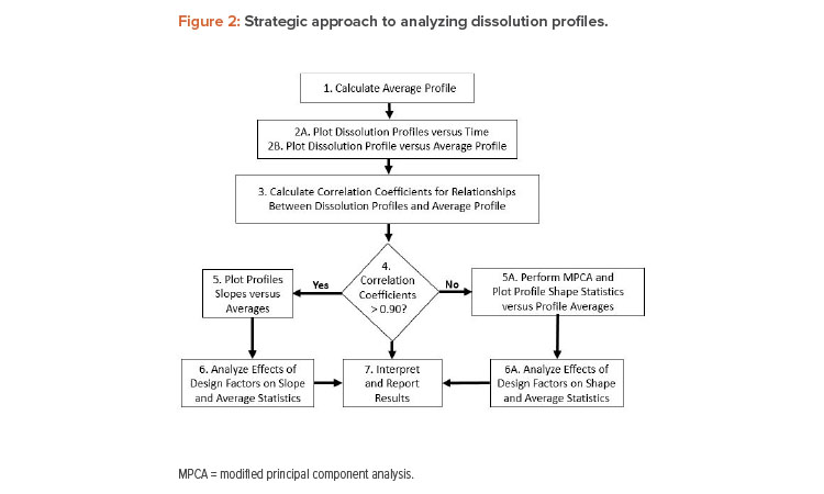
The proposed method of dissolution profile linearization will be illustrated using the dissolution data shown in Figure 1 and Table 2 1 . The data consist of a reference profile plus four test batches. Dissolution measurements are made at six time periods: 15, 30, 45, 60, 75, and 90 minutes. The analysis of these profiles proceeds as shown in Figure 2.
Step 1
Compute the average profile curve found by averaging across the five batches at each time point. The resulting average profile for Example 1 is shown in the last column of Table 2.
Step 2A
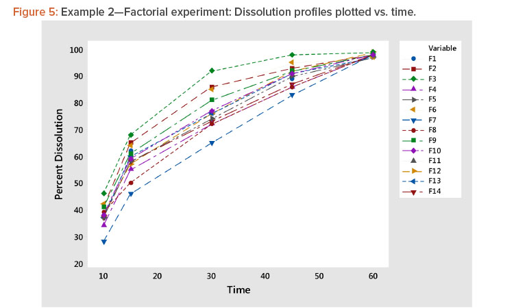
Plot dissolution profiles for each batch vs. time, as shown in Figure 1. In Figure 1, the typical dissolution profile shows a concave pattern of increasing response plateauing around 100%. The profiles show different levels and shapes. For example, the test batch 4 profile starts at a high level and increases slowly, whereas the test batch 1 profile starts at a low level and increases rapidly toward 100%.
Step 2B
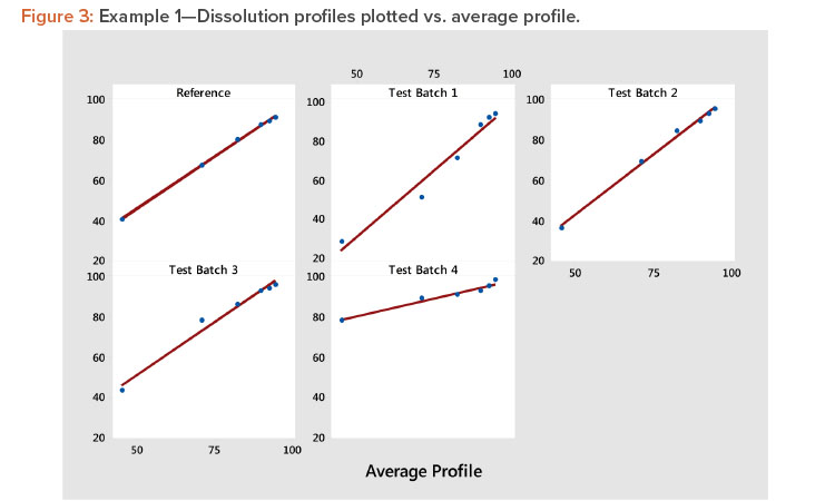
Plot the profiles for each batch vs. average profile, as shown in Figure 3. In Figure 3, we see all profiles show a strong linear relation when plotted vs. the average profile. This indicates that the average profile provides a useful metameter for time. The plot further shows that the profile average (level) and profile slope (shape) summarize the information in the profiles. As a result, we have the summarized the six points on the curve into two statistics.
Step 3
Compute correlation coefficients for each profile vs. the average profile to check the adequacy of the fit of the linear relationship.
Step 4
Examine the size of the correlation coefficients calculated in step 3. The correlation coefficients are all larger than 0.983, confirming the strong relationship observed in Figure 3. Correlation coefficients greater than 0.90 are generally associated with strong positive relationships, suggesting that the results of the experiment can be evaluated using the slope and the average of each profile. When one or more of the correlation coefficients are less than 0.90, one should consider using MPCA as suggested by Wang and colleagues 3 . This method can describe a wide variety of profile shapes in the same set of experimental results.
| Time (minutes) |
F1 | F2 | F3 | F4 | F5 | F6 | F7 | F8 | F9 | F10 | F11 | F12 | F13 | F14 | Average Profile |
|---|---|---|---|---|---|---|---|---|---|---|---|---|---|---|---|
| 10 | 38 | 41 | 46 | 34 | 37 | 42 | 28 | 39 | 41 | 38 | 37 | 38 | 37 | 37 | 38.1 |
| 15 | 62 | 65 | 68 | 55 | 58 | 64 | 46 | 50 | 61 | 59 | 60 | 57 | 60 | 58 | 58.8 |
| 30 | 81 | 86 | 92 | 72 | 74 | 85 | 65 | 72 | 81 | 77 | 76 | 76 | 76 | 73 | 77.6 |
| 45 | 89 | 93 | 98 | 86 | 90 | 95 | 83 | 86 | 92 | 91 | 90 | 92 | 91 | 87 | 90.2 |
| 60 | 97 | 98 | 99 | 98 | 97 | 97 | 98 | 98 | 98 | 98 | 97 | 99 | 97 | 98 | 97.8 |
| Average | 73.4 | 76.6 | 80.6 | 69 | 71.2 | 76.6 | 64 | 69 | 74.6 | 72.6 | 72 | 72.4 | 72.2 | 70.6 | 72.5 |
| Profile | Ac-Di-Sol | Klucel EXF | Average | Slope | Correlation with Average Profile |
|---|---|---|---|---|---|
| F1 | 60 | 25 | 73.4 | 0.972 | 0.996 |
| F2 | 60 | 20 | 76.6 | 0.962 | 0.991 |
| F3 | 60 | 15 | 80.6 | 0.933 | 0.981 |
| F4 | 50 | 25 | 69.0 | 1.040 | 0.997 |
| F5 | 50 | 20 | 71.2 | 1.002 | 0.999 |
| F6 | 50 | 15 | 76.6 | 0.956 | 0.993 |
| F7 | 40 | 25 | 64.0 | 1.143 | 0.989 |
| F8 | 40 | 20 | 69.0 | 0.996 | 0.986 |
| F9 | 40 | 15 | 74.6 | 0.967 | 0.999 |
| F10 | 50 | 20 | 72.6 | 1.007 | 1.000 |
| F11 | 50 | 20 | 72.0 | 0.995 | 0.999 |
| F12 | 50 | 20 | 72.4 | 1.035 | 0.999 |
| F13 | 50 | 20 | 72.2 | 1.003 | 0.999 |
| F14 | 50 | 20 | 70.6 | 0.988 | 0.997 |
Step 5
Compute the coefficients for the linear relationship between each profile and the average profile. The resulting A (level) and B (slope) statistics for the five profiles shown in Table 3 indicate the following:
- Test batch 4 and test batch 1 profiles have the highest and lowest averages (levels) at 90.7 and 70.7, respectively.
- Test batch 4 and test batch 1 profiles have the lowest and highest slope (shape) values at 0.361 and 1.376, respectively. This indicates that, because the slope of the average profile is 1.0, the test batch 4 slope is 36.1% of the average profile and the test batch 1 slope is 37.6% more than the slope of the average profile.
Step 5A
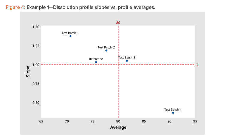
Using the results of step 5, plot the slope (shape) vs. the average (level) statistics for all profiles to see graphically how they relate to each other. For guidance, dashed lines can be plotted for slope = 1 (slope of the average profile) and average = average of the average profile, as shown in Figure 4.
In Figure 4, we see several important patterns:
- There is a strong negative correlation between the shape and level statistics because the profiles have a high dissolution at the minimum time period of 15 minutes.
- More important, the strong correlation indicates that we need only analyze the profile average (level), as the analysis of the shape will produce the same results due to the correlation between the level and shape statistics.
- The strong correlation between the level and shape statistics is not uncommon for dissolution profiles. In this example, the correlation is negative. In instances where the profiles start at low dissolution levels, the correlation will be positive. The important consideration is the correlation strength rather than its direction. A strong correlation, positive or negative, indicates the profiles can be compared by analyzing their level statistics.
Step 6
Analyze the level and shape statistics according to the sources of variation in the experiment design. This step will be illustrated in the analysis of a 3×3 factorial experiment discussed in Example 2.
Step 7
Interpret and report the results of the experiment.
Example 2: Dissolution Experiment Using a 3×3 Factorial Design
Example 2 involves an experiment that uses a 3×3 factorial design to study the effects of two ingredients on the dissolution of efavirenz tablets7 . The design consisted of the nine factorial points with five replicate points at the center point (Formulations 5, 10–14) for 14 formulations. The resulting dissolution profiles are shown in Table 4. The ingredients that make up each of the 14 formulations are provided in Table 5.
For Example 2, steps 1–5 of the analysis described previously and in Figure 2 produced the following results:
- Plotting the profiles vs. time showed a family of concave curves typical of dissolution profiles (Figure 5).
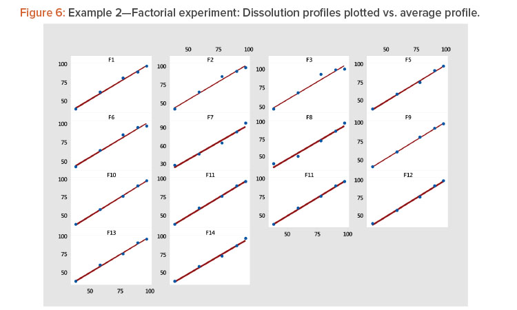
- Plotting each profile vs. the average profile showed that the linear model provided a good fit to the data (Table 4, Figure 6). The linear model correlation coefficients for the 14 profiles ranged from 0.981 to 1.000 (Table 5).
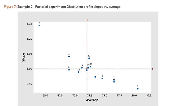
- A plot of the linear model coefficients (slope vs. average) showed a strong negative correlation (Figure 7), indicating that as the level of the profile increased, the slope decreased.
| Model for Average | Model for Slope | |||||||
|---|---|---|---|---|---|---|---|---|
| Term | Coef | SE Coef | T-Value | P-Value | Coef | SE Coef | T-Value | P-Value |
| Constant | 71.9 | 0.265 | 271.05 | 0.000 | 1.0013 | 0.0083 | 121.23 | 0.000 |
| X1 = Ac-Di-Sol | 3.83 | 0.282 | 13.57 | 0.000 | –0.0397 | 0.0088 | –4.51 | 0.002 |
| X2 = Klucel EXF | –4.23 | 0.282 | –14.99 | 0.000 | 0.0497 | 0.0088 | 5.65 | 0.000 |
| X1 SQ | 0.68 | 0.411 | 1.65 | 0.138 | –0.0109 | 0.0128 | –0.85 | 0.421 |
| X2 SQ | 0.68 | 0.411 | 1.65 | 0.138 | 0.0078 | 0.0128 | 0.61 | 0.557 |
| X1*X2 | 0.85 | 0.346 | 2.46 | 0.039 | –0.0341 | 0.0108 | –3.16 | 0.013 |
| Residual Std. Dev. | 0.69 | 0.022 | ||||||
| Adjusted R2 value | 97 | 82 | ||||||
Coef: Model regression coefficient
SE Coef: Coefficient standard error
T-Value: Student’s T statistic = Coef/SE Coef
P-Value: Probability level associated with T statistic
| Time (minutes) |
A-2 | B-2 | C-2 | A-4 | B-4 | C-4 | Average Profile |
|---|---|---|---|---|---|---|---|
| 6 | 62 | 48 | 25 | 16 | 9 | 4 | 27.3 |
| 12 | 88 | 68 | 46 | 38 | 18 | 12 | 45.0 |
| 20 | 94 | 80 | 63 | 63 | 30 | 22 | 58.7 |
| 30 | 95 | 86 | 74 | 80 | 41 | 30 | 67.7 |
| 45 | 96 | 88 | 80 | 92 | 55 | 43 | 75.7 |
| 60 | 95 | 90 | 82 | 95 | 64 | 52 | 79.7 |
| Average | 88.3 | 76.7 | 61.7 | 64.0 | 36.2 | 27.2 | 59.0 |
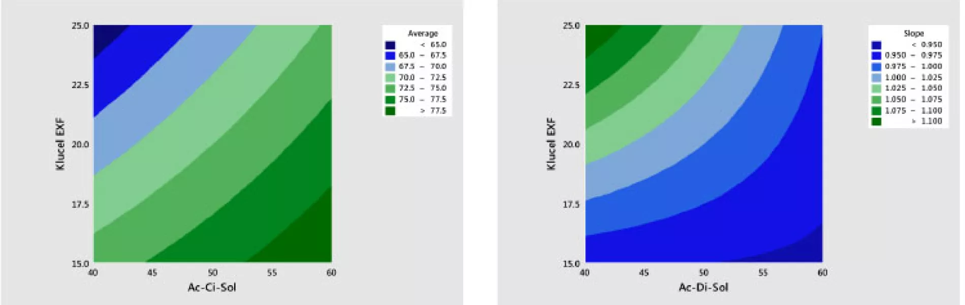
Step 6 in the analysis is to study the effects of the two ingredients (X1 = Ac-Di-Sol and X2 = Klucel EXF) on the average (level) and slope (shape) of the dissolution profile. A quadratic response surface model8 of the following form was developed separately for average and slope values:
Y = b0 + b1X1 + b2X2 + b12X1X2 + b11X12 + b22X22
where:
Y is the profile average or slope
b represents coefficients to be estimated from the data
X1 is the amount of Ac-Di-Sol
X2 is the amount of Klucel EXF
The results of fitting these models in standardized form are shown in Table 6. It is shown that there are statistically significant linear and interaction effects for both variables. The linear terms dominate. The quadratic terms are not statistically significant. The models give a good fit to the data; the adjusted R2 values for the average and slope are 97% and 82%, respectively.
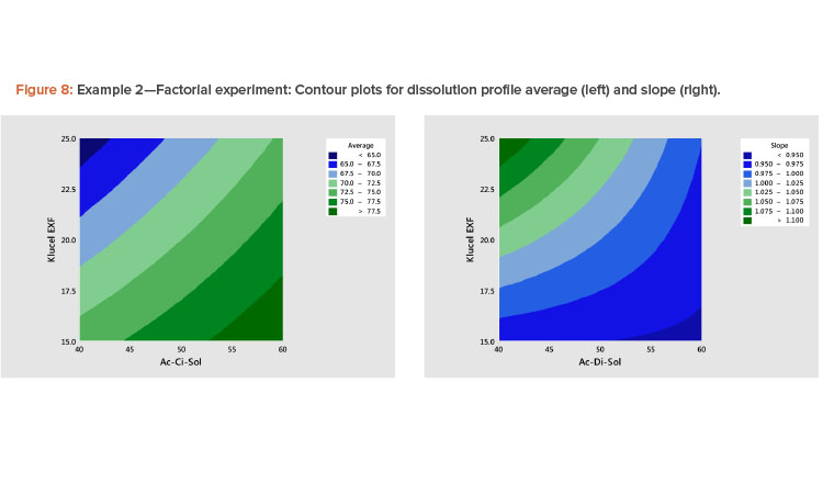
The best way to see these effects is to examine response surface contour plots for the average and slope shown in Figure 8. The negative relationship between the profile average and slope that we saw in Figure 6 is evident in Figure 8, in which high average profile values are at low X1 – high X2 and high slope values are at high X1 – low X2 values.
| Code | Product | Apparatus | Average | Slope | Correlation with Average Profile |
|---|---|---|---|---|---|
| A-2 | A | USP 2 | 88.3 | 0.586 | 0.918 |
| B-2 | B | USP 2 | 76.7 | 0.795 | 0.981 |
| C-2 | C | USP 2 | 61.7 | 1.118 | 0.997 |
| A-4 | A | USP 4 | 64.0 | 1.582 | 0.998 |
| B-4 | B | USP 4 | 36.2 | 1.035 | 0.973 |
| C-4 | C | USP 4 | 27.2 | 0.884 | 0.968 |
- 7Majji, A., and A. S. Shewale. “Formulation and Optimization of Intermediate Release Dosage Form of Efavirenz Using Design of Experiments.” International Journal of Pharmaceutical Sciences Review and Research 24, no. 2 (2014): 245–50.
- 8Montgomery, D. C. Design and Analysis of Experiments. 8th ed. New York: John Wiley and Sons, 2013.
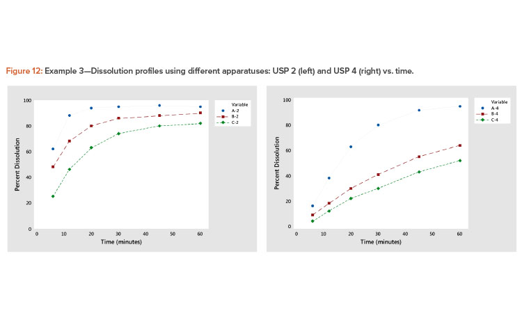
Example 3: Comparing Dissolution Profiles Using Different USP Apparatuses
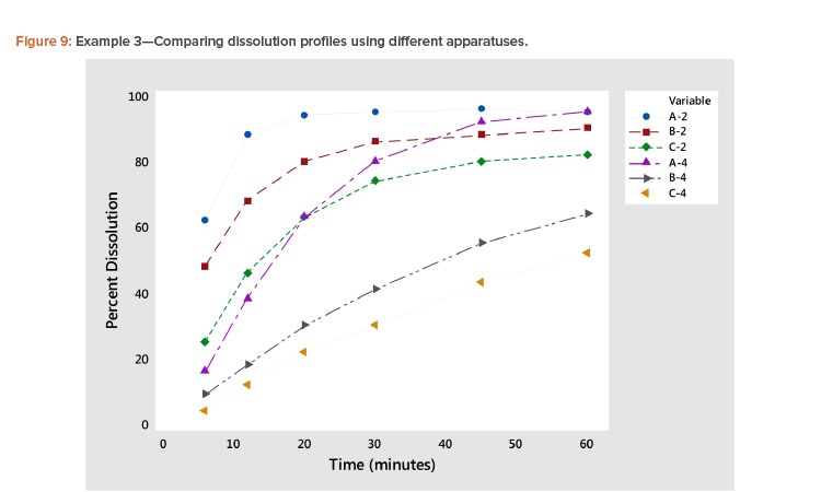
Plotting dissolution profiles vs. the average profile sometimes doesn’t fit all the profiles equally well. This is particularly true when the collection of profiles covers a wide range of levels and shapes, such as shown in Example 3 (Table 7). In Figure 9, we see profiles ranging from small curvature (profiles B-4 and C-4) to large curvature (profiles A-4 and A-2). The data in Table 7 and Figure 9 are from a study involving three products, A, B, and C, analyzed by two apparatuses, USP 2 and USP 49 .
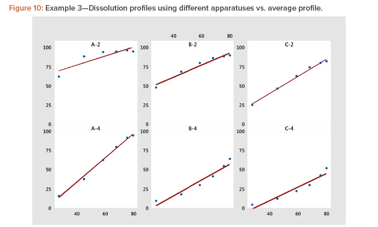
In Figure 10 and Table 8, we see that the linear fit is very good for all the profiles except the first, Profile A-2, where the correlation with the average profile is a respectable 0.918. All the other correlation coefficients range from 0.968 to 0.998 (Table 8). Even for dissolution profile A-2, the average profile metameter captures 84% (R2 = 0.918 × 0.918 = 0.843) of the variation in the profile.
- 9Hurtado y de la Peña, Marcela, Yolanda Vargas Alvarado, Adriana Miriam Domínguez-Ramírez, and Alma Rosa Cortés Arroyo. “Comparison of Dissolution Profiles for Albendazole Tablets Using USP Apparatus 2 and 4.” Drug Development and Industrial Pharmacy 29, no. 7 (August 2003): 777–84.
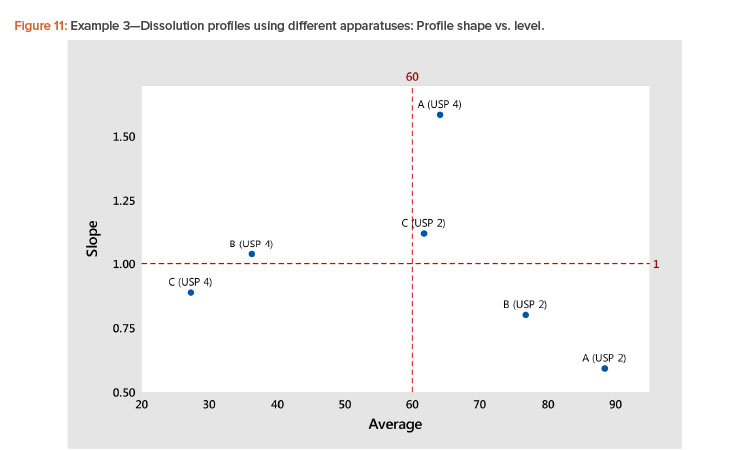
In the plot of the dissolution profile slopes vs. the level shown in Figure 11, we see that the two apparatuses produce different dissolution profiles. We see linear relationships between the level and slope statistics, but the relationship is different for the two apparatuses. The differences in the dissolution profile for the two apparatuses are apparent in Figure 12, where the dissolution profiles of the two apparatuses are plotted separately.
We also see in Figure 11 that the Product A (USP 4) profile is different from all the other profiles. This different dissolution profile for Product A is apparent in both Figures 11 and 12.
As noted earlier in the discussion of step 4 of the proposed method for dissolution profile linearization, when there is a concern about the ability of plotting vs. the average profile as a way to linearize the profiles, the MPCA discussed by Wang and coauthors3 can be used. It was applied in this case. Although the MPCA gave a better fit, the conclusions were unchanged. This leads to the conjecture, which is supported by the analysis of other dissolution studies, that the average profile captures most of the variation in profile even when the linear fit is not perfect. In any event, we are led to the conclusion that a good strategy is to use the average profile as a first choice in modeling the dissolution profile. If a better fit is needed or desired, the MPCA approach should be used.
An Effective Strategy
dissolution profile is a critical property of a pharmaceutical. This article presents a method that overcomes many, if not all, of the limitations of previously available methods. The method provides statistics that relate to dissolution profile level and shape. This is accomplished by finding a time metameter that linearizes the dissolution profile. The average dissolution profile is one such metameter that works in many different situations. This approach is not as statistically sophisticated as the MPCA method. However, it is very effective and has broad utility, and the associated computations are easier to perform.
When a metameter that more closely approximates the dissolution profile is desired, the MPCA method is recommended3 ,10 . Both approaches reduce the dissolution profile to two statistics: level and shape. These statistics are then analyzed using the methods appropriate to the experiment design used to generate the dissolution profile, as illustrated in Example 2. The needed calculations are available in most statistical software packages. The statistical analysis results are easy to understand and relate to the practical context of the experiment.
When the value of doing the MPCA is not clear, it is recommended that both methods be used and the overall conclusions compared. If little or no additional information is provided by the MPCA, one’s confidence in the results of the analysis of the linearized profiles slope and profile average is increased.